ROOM On Demand
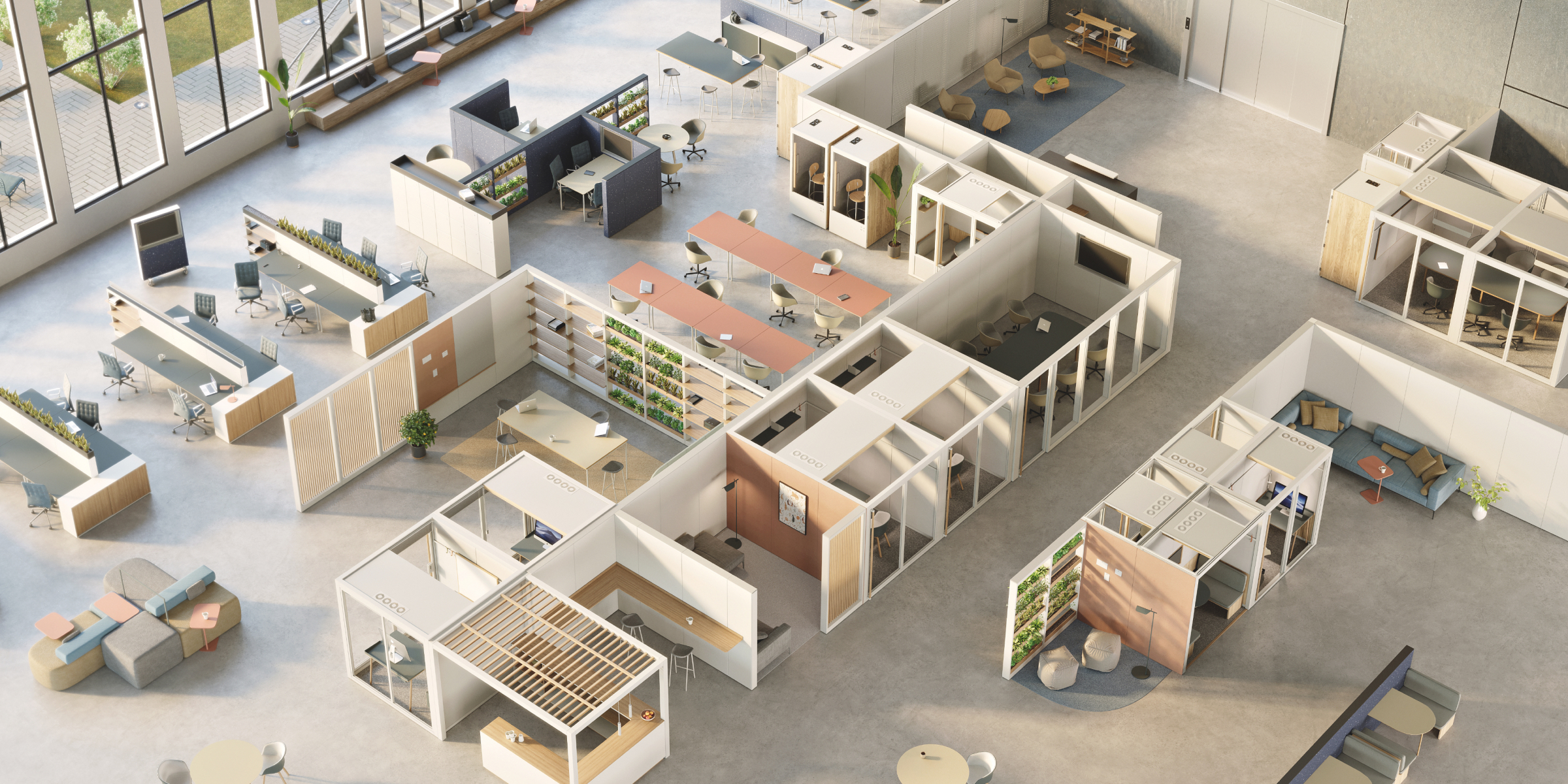
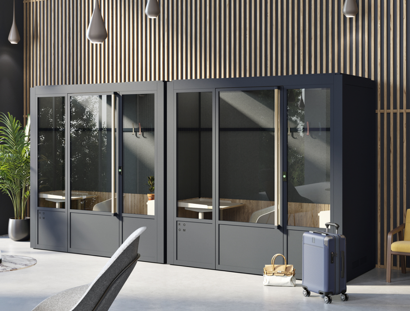
ROOM on Demand follows the modern worker on their hybrid journey,
providing access to soundproof private offices and meeting spaces
where and when they need it most.
Business Objective+
Validate and test user demand for this service.
Provide value to partners by enhancing their service offerings.
Create a digital experience that's cohesive with ROOM's existing products.
Develop a touchpoint where we can connect with our end-users.
Provide value to partners by enhancing their service offerings.
Create a digital experience that's cohesive with ROOM's existing products.
Develop a touchpoint where we can connect with our end-users.
Team+
Alex - Product Design, PM
Hannah - PM
Robert - Backend Engineer
Sasha - Frontend Engineer
Raul - Hardware Engineer
Jayoon - Hardware PM
Hannah - PM
Robert - Backend Engineer
Sasha - Frontend Engineer
Raul - Hardware Engineer
Jayoon - Hardware PM
Deliverables+
MVP for pilot program.
Framework for future mobile apps.
Framework for future mobile apps.
0%
of full-time employees are working from
somewhere other than an office on any given day.
Pew Research Center
somewhere other than an office on any given day.
Pew Research Center
Problem
In today's evolving work environment, professionals often work outside traditional office settings, but public and shared spaces fail to provide the necessary privacy and quiet for calls and focused work. The current methods for discovering and booking suitable workspaces are fragmented, inefficient, and inconsistent - leading to disruptions and decreased productivity.
Solution
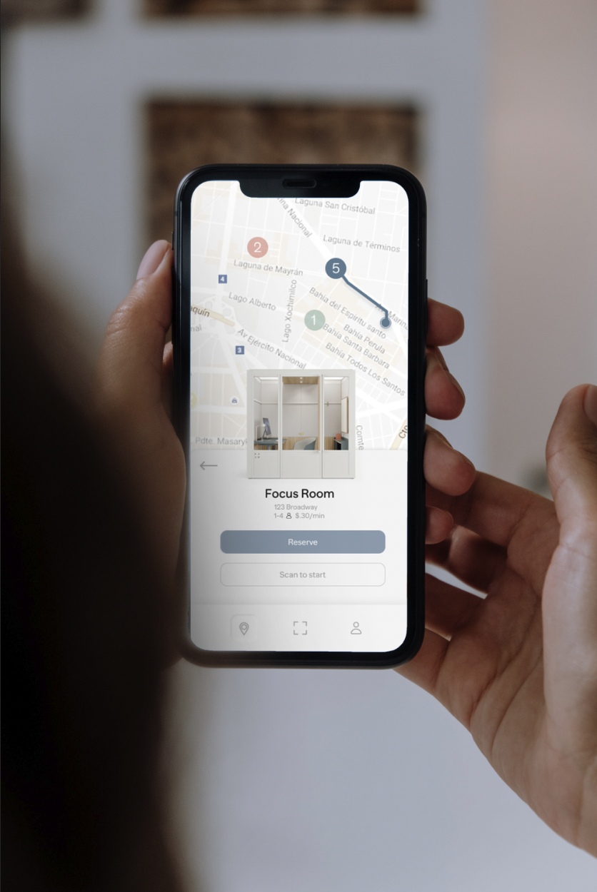
We aim to address these challenges by leveraging our physical products and developing a seamless experience for workspace discovery and instant booking. Our goal is to provide on-demand access to our modular office pods, offer an intuitive way to discover new workspaces, and enhance productivity and professionalism for remote workers and business travelers.
Key Points
Fragmented Discovery and Booking Existing solutions for finding and booking workspaces are disjointed and inefficient.
Need for Privacy and Quiet Public and shared spaces do not adequately provide for private, soundproof environments necessary for calls and focused work.
Inconsistent Experiences Professionals face varying experiences across different workspaces, impacting their productivity and convenience.
Demand for On-Demand Access There is a strong need for a reliable, real-time booking system that guarantees private workspace availability when needed.
Discover
Getting to know
the modern worker.
the modern worker.
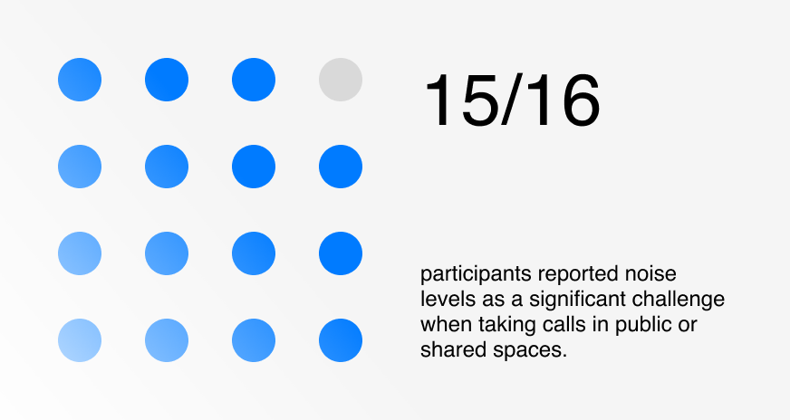
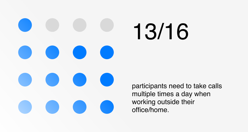
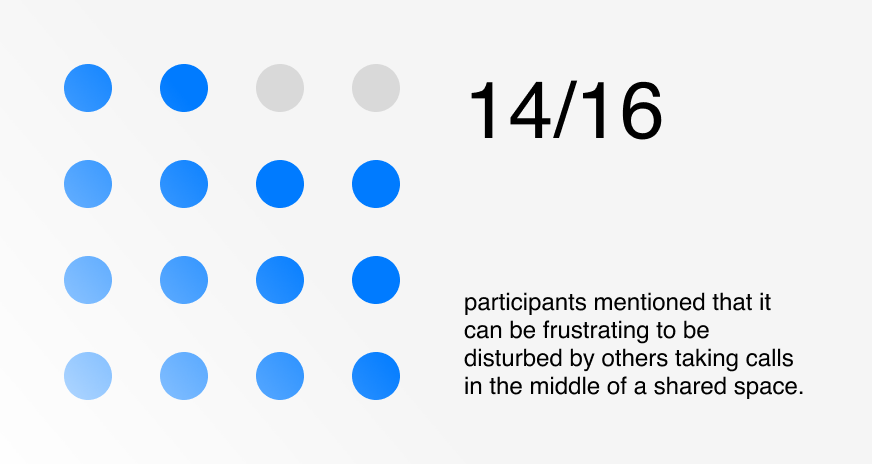
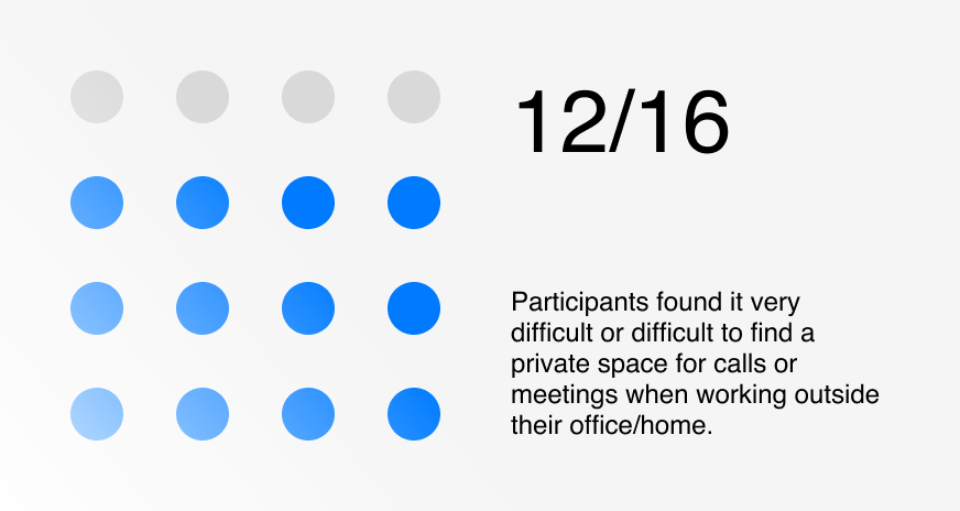
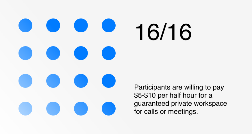
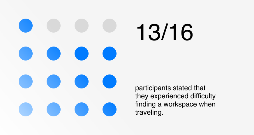
We conducted surveys with 16 participants to gather general insights about their pain points and needs when working from public or shared spaces. We then conducted one-on-one interviews with three selected participants from different industries and work styles to take a deeper look into their specific challenges and requirements.
User Surveys
To gather a broad understanding of the challenges faced by modern workers, we conducted surveys with 16 participants. These surveys provided general insights into their pain points and needs when working from public or shared spaces.
User Interviews
Key Takeaways
Noise and Privacy All participants emphasized the need for quiet, private spaces for calls and focused work.
Willingness to Pay Users are willing to pay $5-10 per half hour for guaranteed private spaces. private enough for important calls and meetings, especially during peak times.
Noise and Privacy All participants emphasized the need for quiet, private spaces for calls and focused work.
Willingness to Pay Users are willing to pay $5-10 per half hour for guaranteed private spaces. private enough for important calls and meetings, especially during peak times.
Workspace Discovery There is no easy, direct way to find suitable places to work from.
Meeting Challenges Participants often face difficulties finding spaces that are private enough for important calls and meetings, especially during peak times.
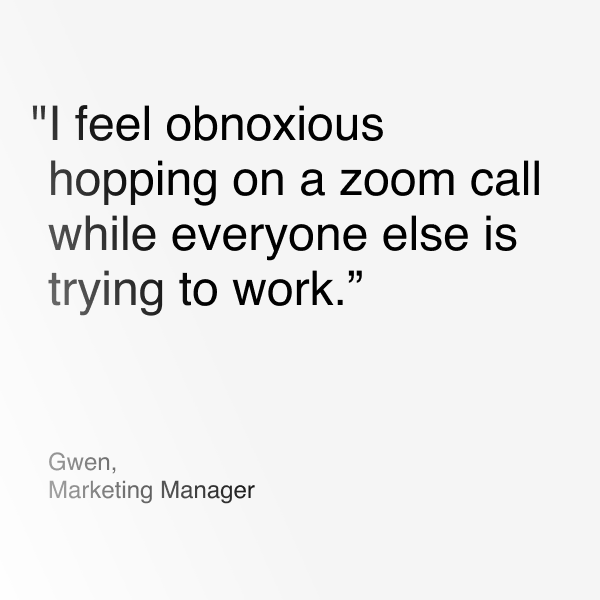
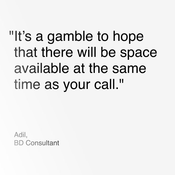
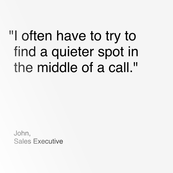
Affinity Map
We synthesized the data from our surveys and interviews using an affinity map. This helped us identify common themes and prioritize user needs and pain points.
Define
Filling a gap in the New World of Work.
After conducting user surveys, one-on-one interviews, and synthesizing the data into an affinity map with high level themes, we were able to begin shaping our solution.
Our analysis confirmed the opportunity to design a product focused on discovering workspaces, providing a real-time booking platform for soundproof private office pods, and ensuring consistent experiences across different locations.
Our analysis confirmed the opportunity to design a product focused on discovering workspaces, providing a real-time booking platform for soundproof private office pods, and ensuring consistent experiences across different locations.
User Persona
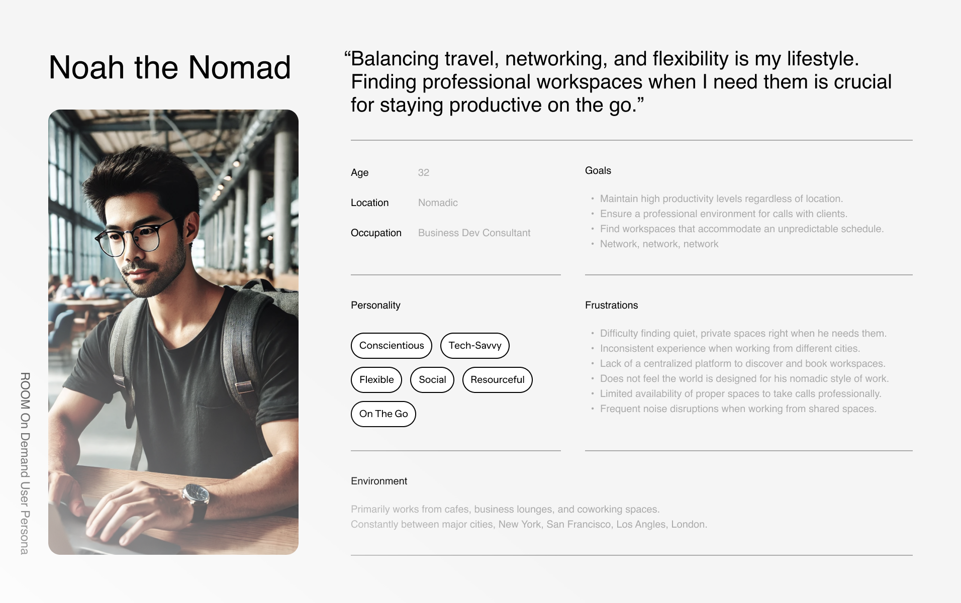
A user persona, Noah the Nomad, was created based on the collected data to guide our decision-making and ensure the product addressed specific user pain points, frustrations, and goals. This persona was kept top of mind and used to help guide our design process.
User Value Props
We identified core value propositions that reflect our users' primary needs and challenges. These insights guide the development of our product, ensuring it delivers meaningful benefits. By focusing on what matters most to our users, we aim to create a product that enhances their overall work experience.
Minimum Viable Product
To ensure we meet user needs effectively, we defined a Minimum Viable Product (MVP) focusing on the most critical features. This approach allows us to deliver essential functionality quickly while gathering user feedback to iterate and improve.
Ideate
I wish I had good
headline for this.
headline for this.
We started by gathering references from other successful apps for inspiration. Next, we sketched out rough UI elements and developed a site map to structure the app's architecture. We then created detailed user flows to visualize the user's journey and ensure a smooth experience.
References
We researched solutions that solve adjacent challenges, identifying concepts we could leverage for functionality, flow, and aesthetics. By analyzing other successful apps, we gained insights into effective design elements and best practices.
Brainstorming
I began with rough sketches to explore various design ideas. We also explored aesthetics and art direction. By iterating on these sketches, we refined our ideas and prepared for more detailed design work in the next steps.
Site Map
We created a site map to define the app's structure and organize its features. This visual layout ensured a logical flow, making navigation intuitive and seamless. .
User Flow
We created detailed user flows to visualize and optimize the user's journey through the app. This helped us ensure a smooth and intuitive experience by identifying potential pain points and streamlining navigation.
Prototype
Making hybrid work, work.
We transformed our concepts into tangible designs. Starting with low-fidelity wireframes, we created initial layouts to test the app's structure and flow. These prototypes allowed us to gather user feedback early and iterate quickly. By progressively refinin1g the designs into high-fidelity mockups, we ensured a polished and user-friendly interface.
Wireframing
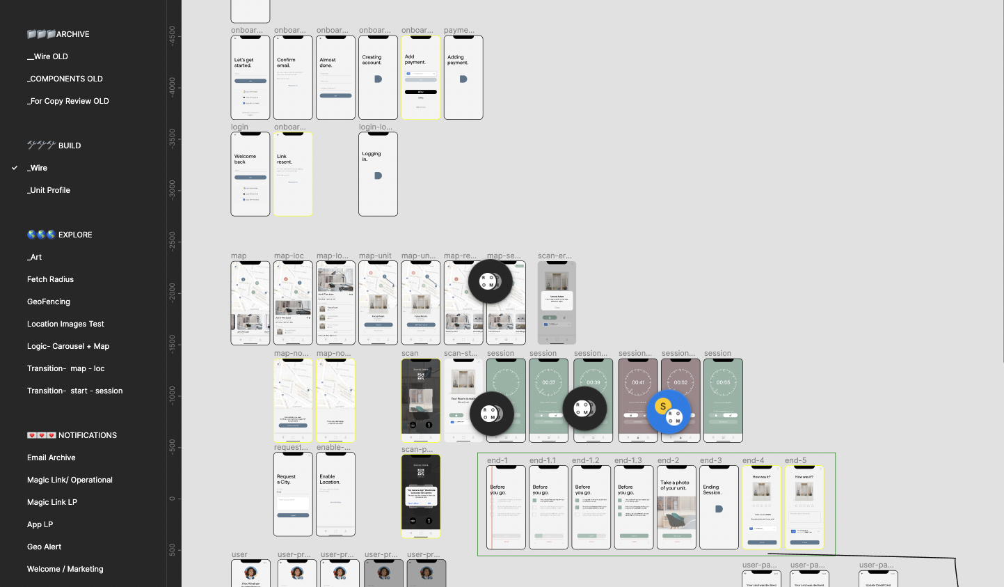
We began with low-fidelity wireframes to outline the app's basic structure and layout. These quick designs allowed us to quickly test and refine the overall flow and functionality.
Design System
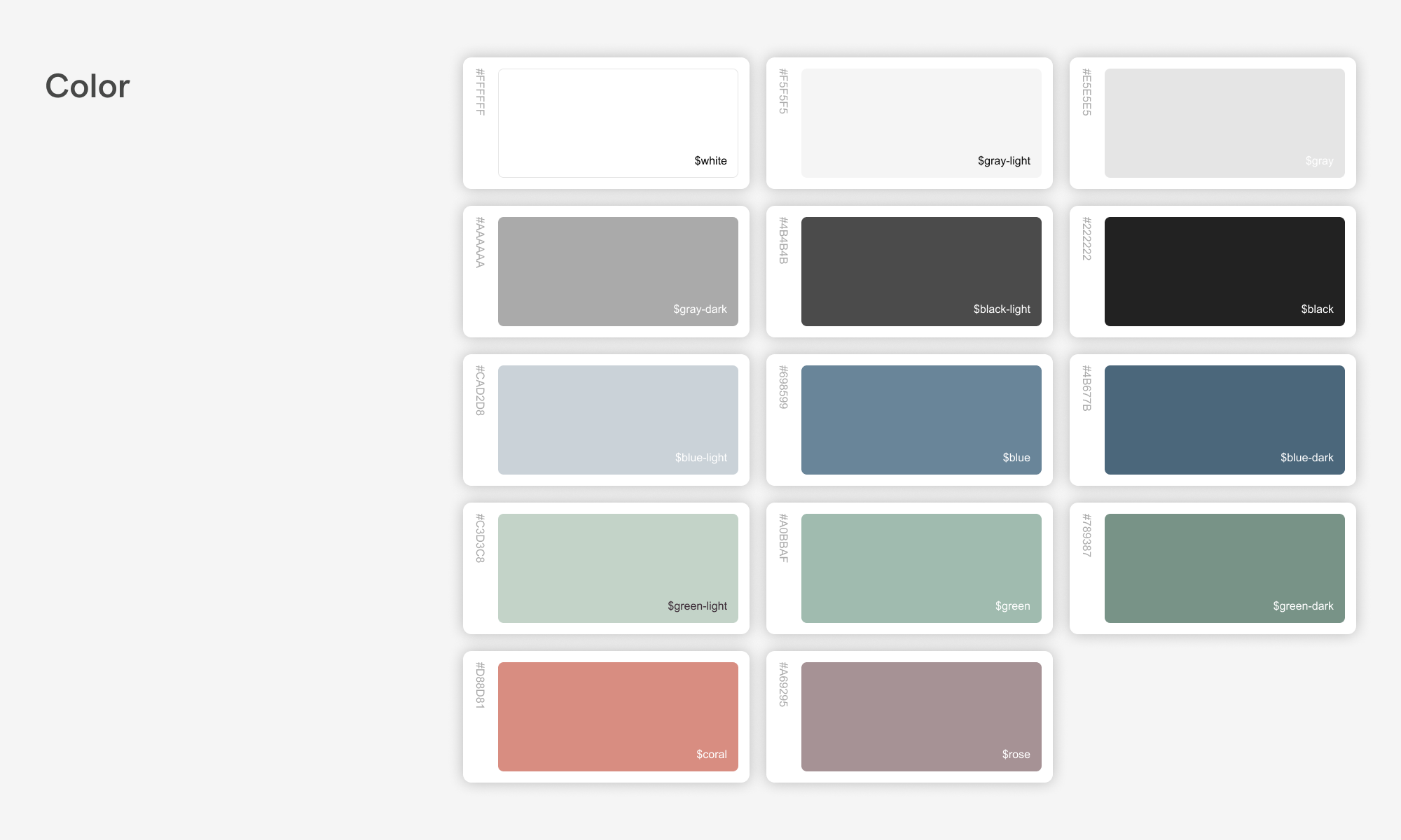
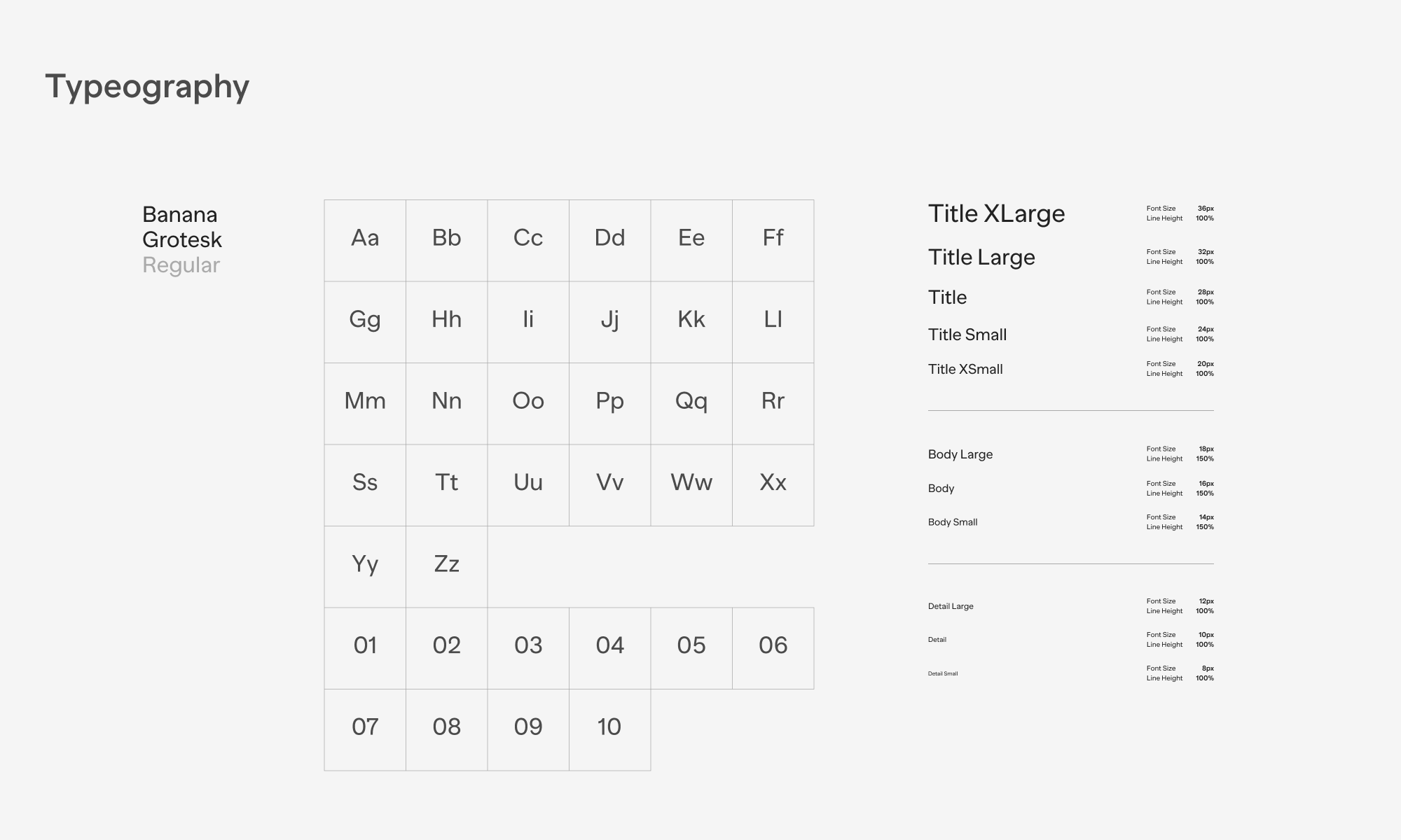
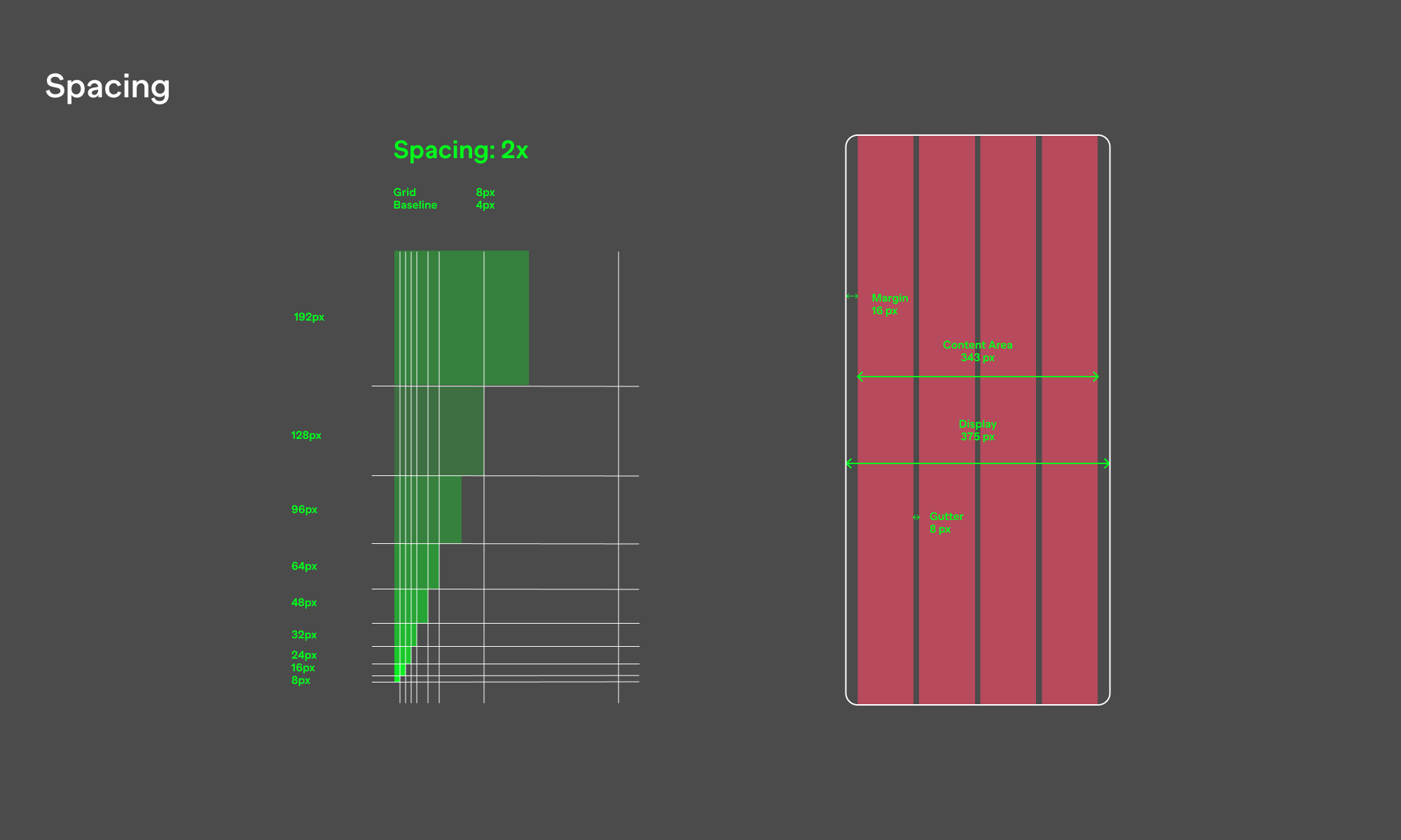
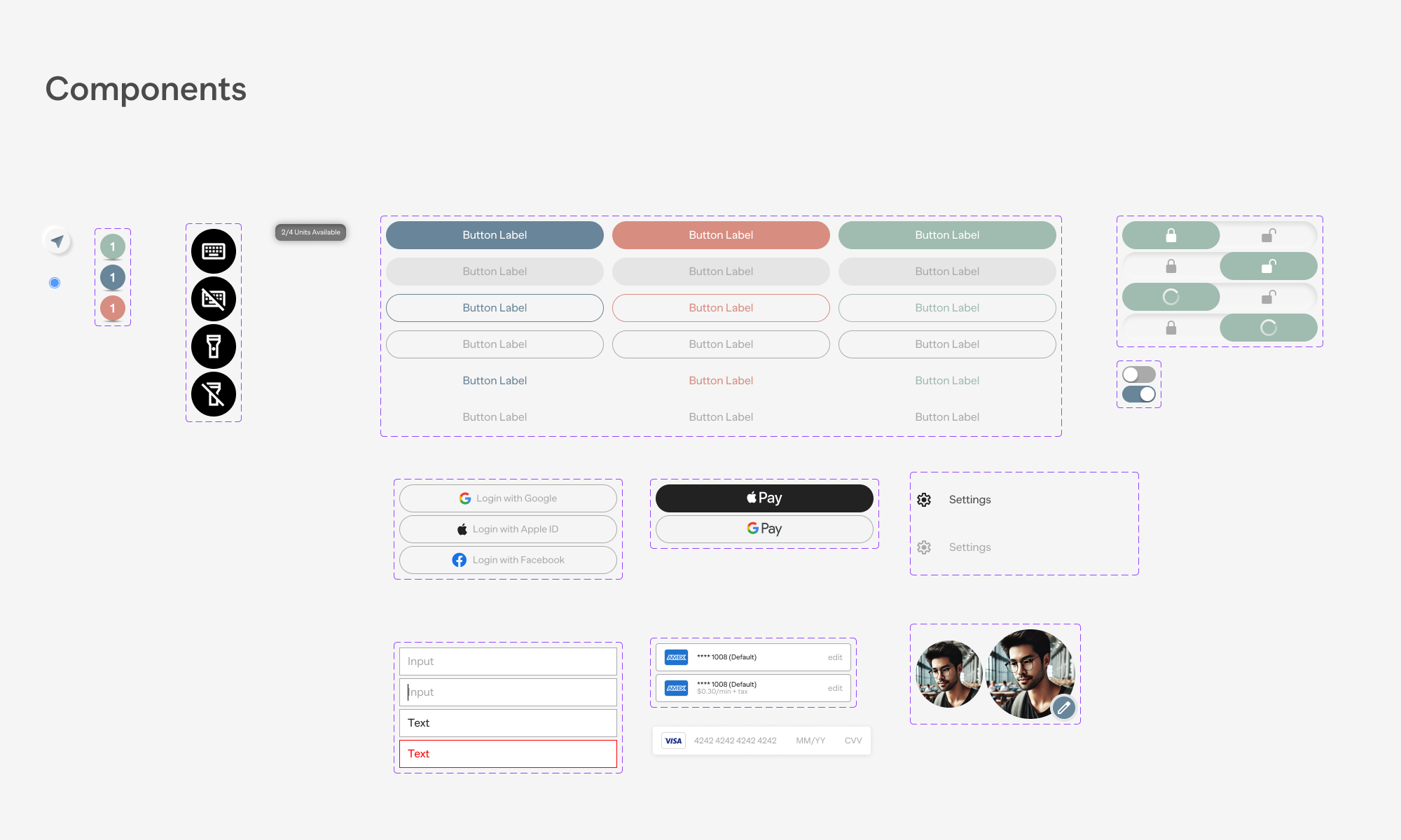
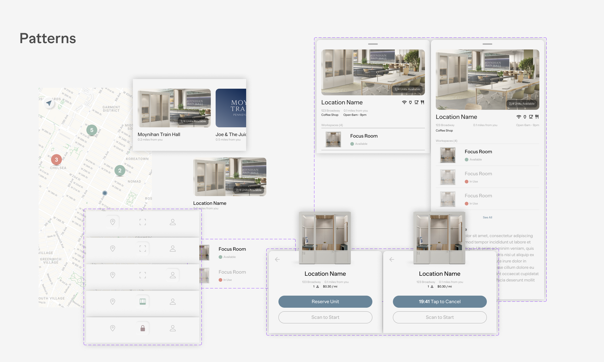
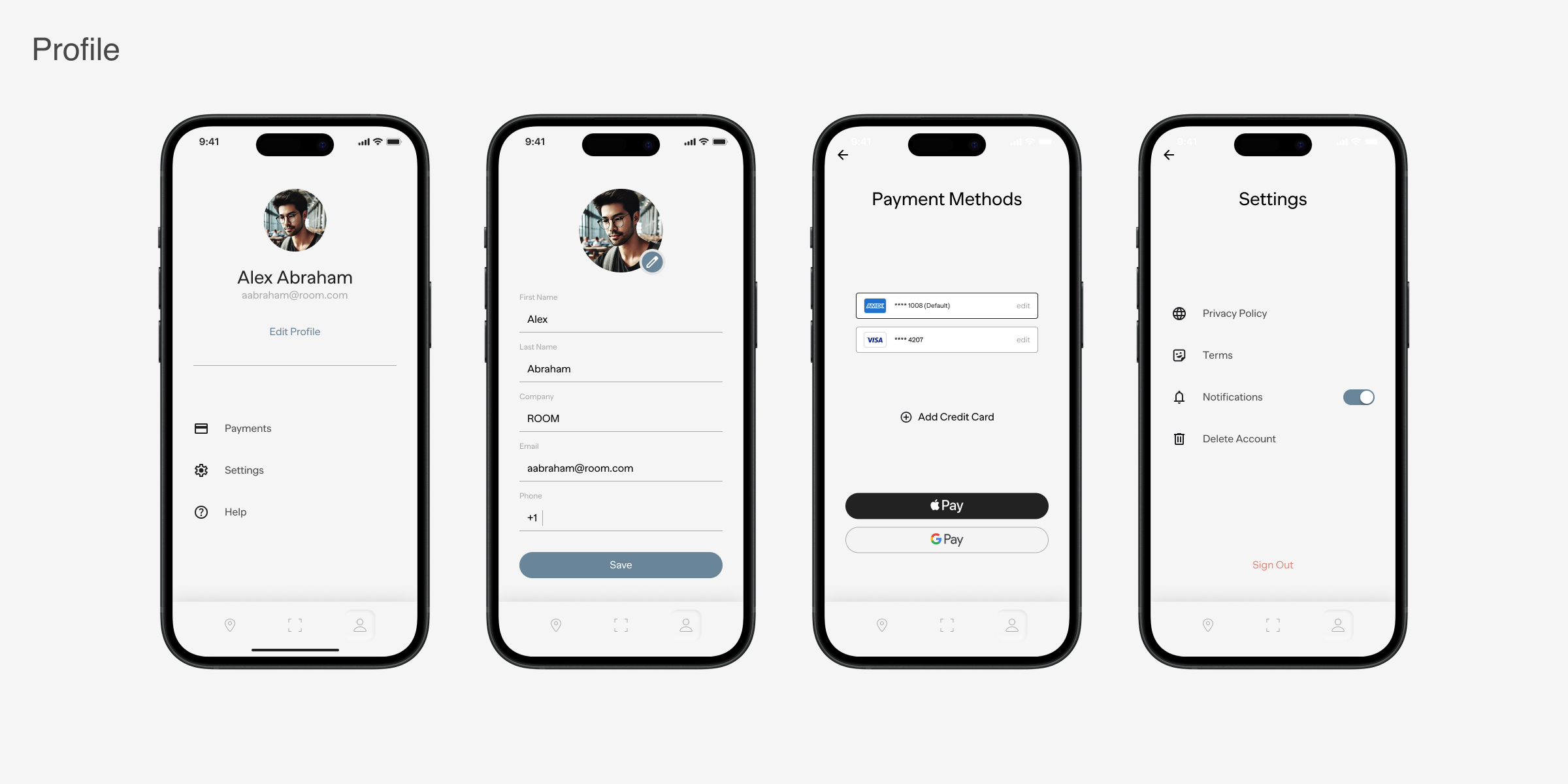
We established a comprehensive design system to ensure consistency across the app. This included defining typography, color schemes, button styles, and other UI elements. The design system provided a unified visual language, making the app intuitive and cohesive while facilitating efficient development and maintenance.
Final Design (v1)
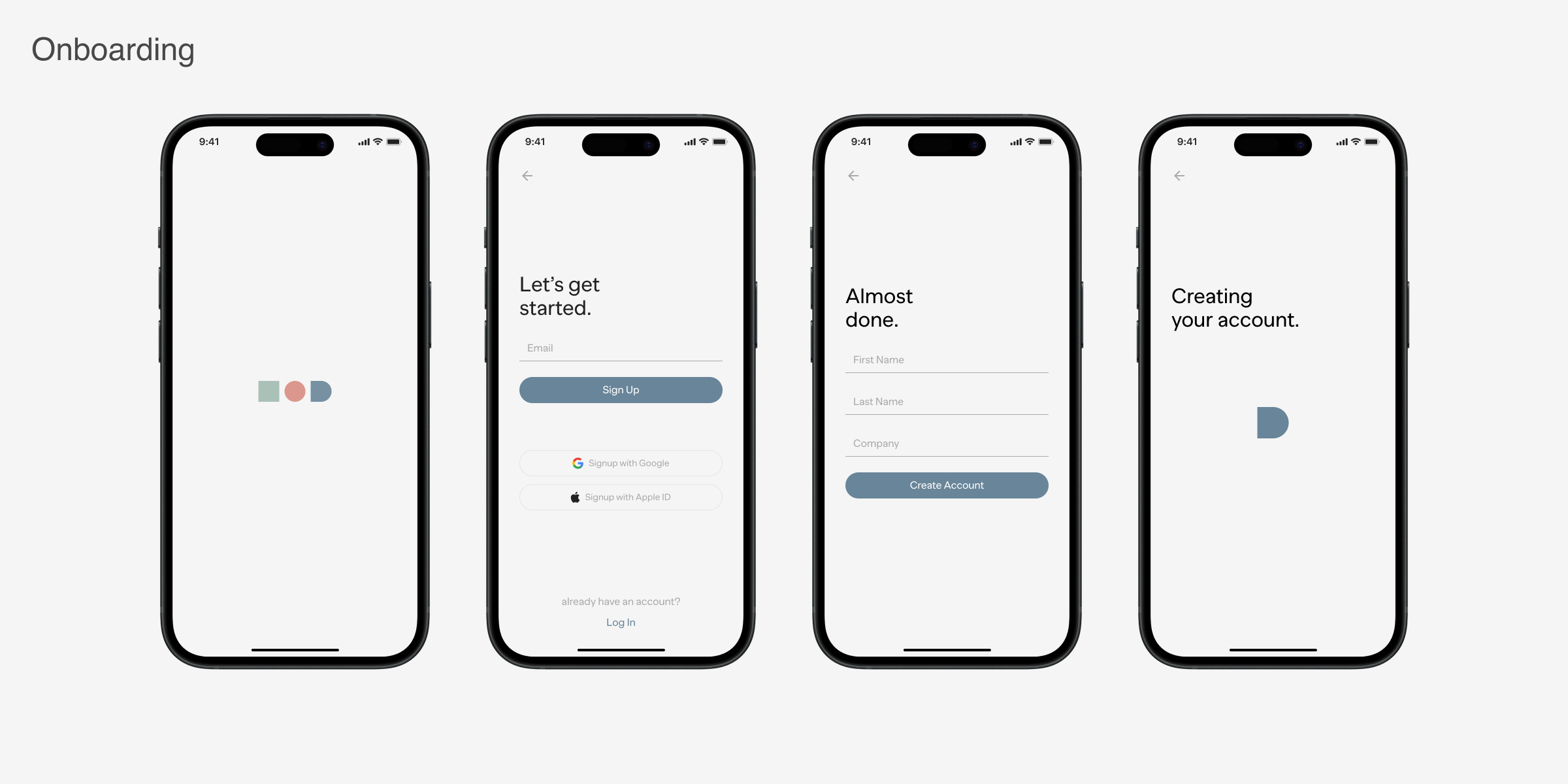
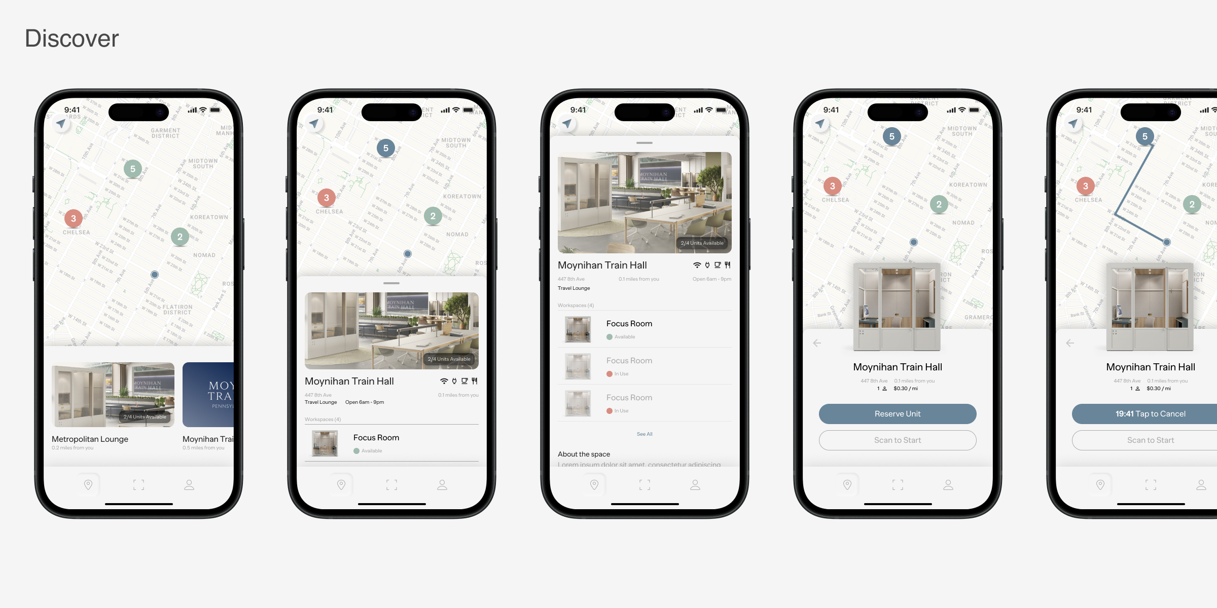
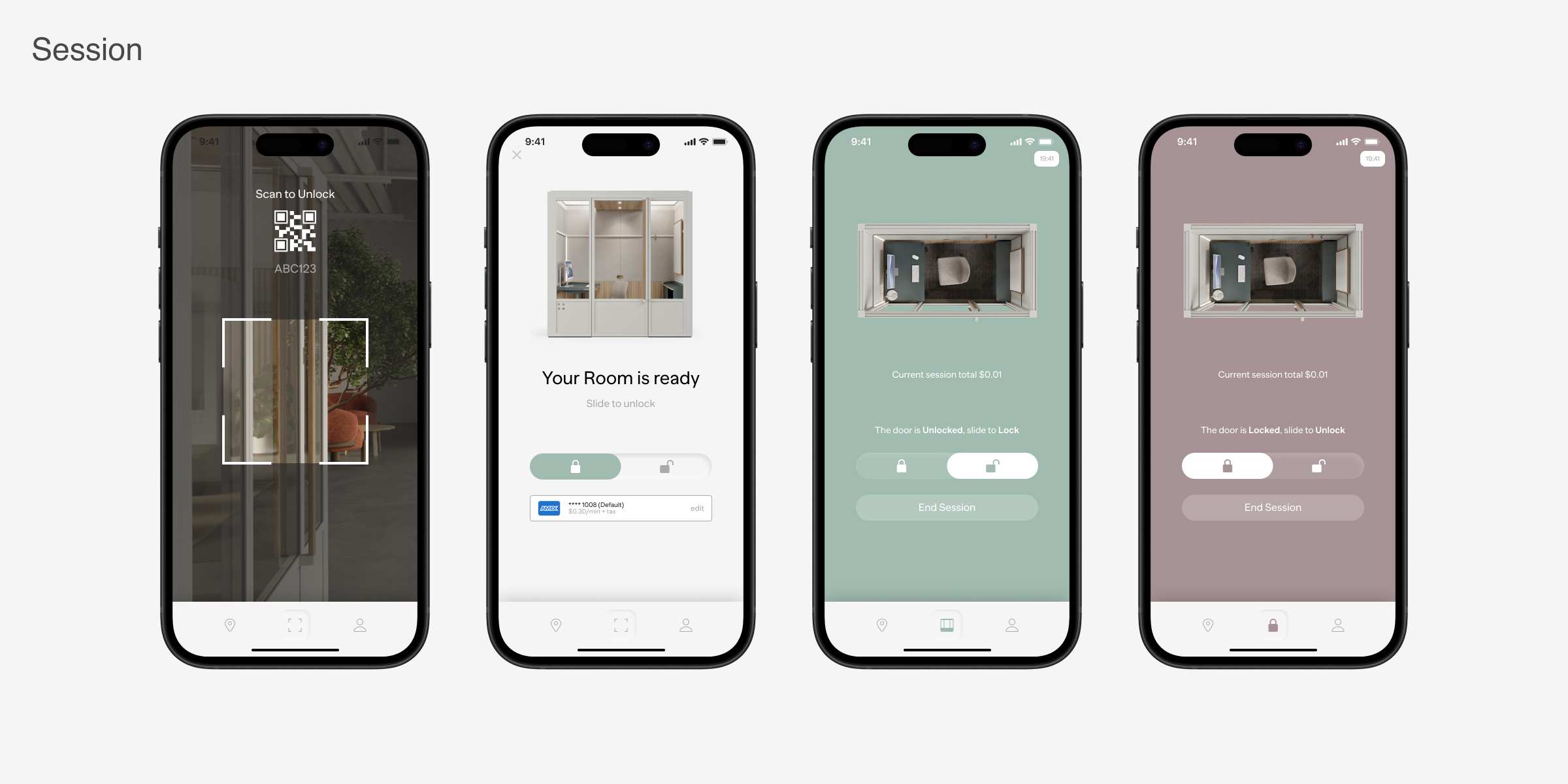
Our final design showcases the polished and refined user interface of the app. After iterating on feedback from prototypes and preliminary testing, we created a high-fidelity design that aligns with our design system and meets user needs. This version integrates all key features, ensuring a seamless and intuitive user experience ready for development and deployment.
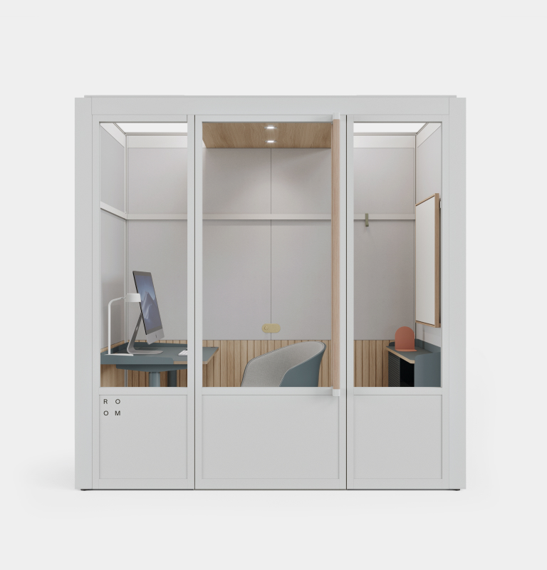
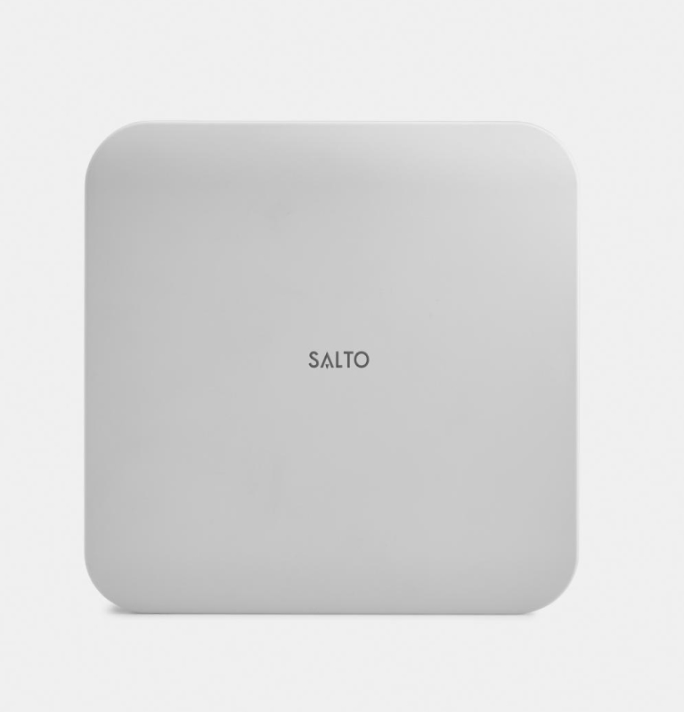
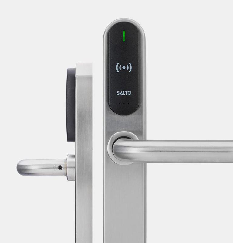
Hardware
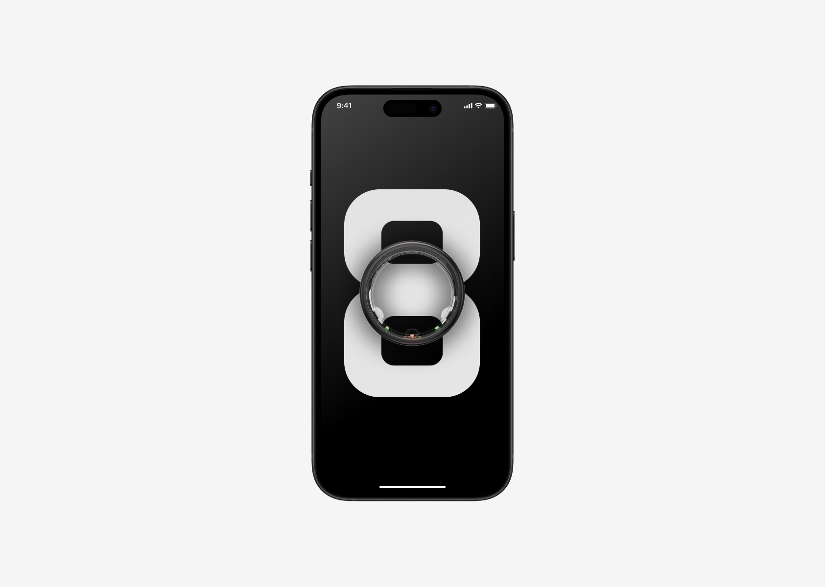
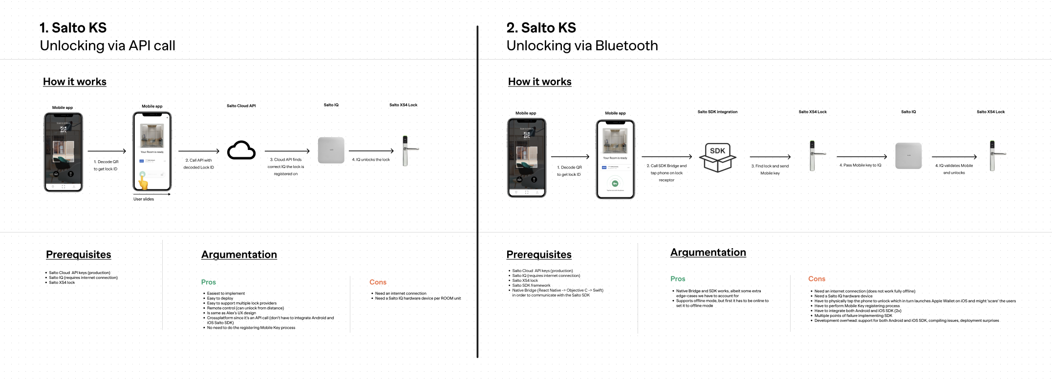
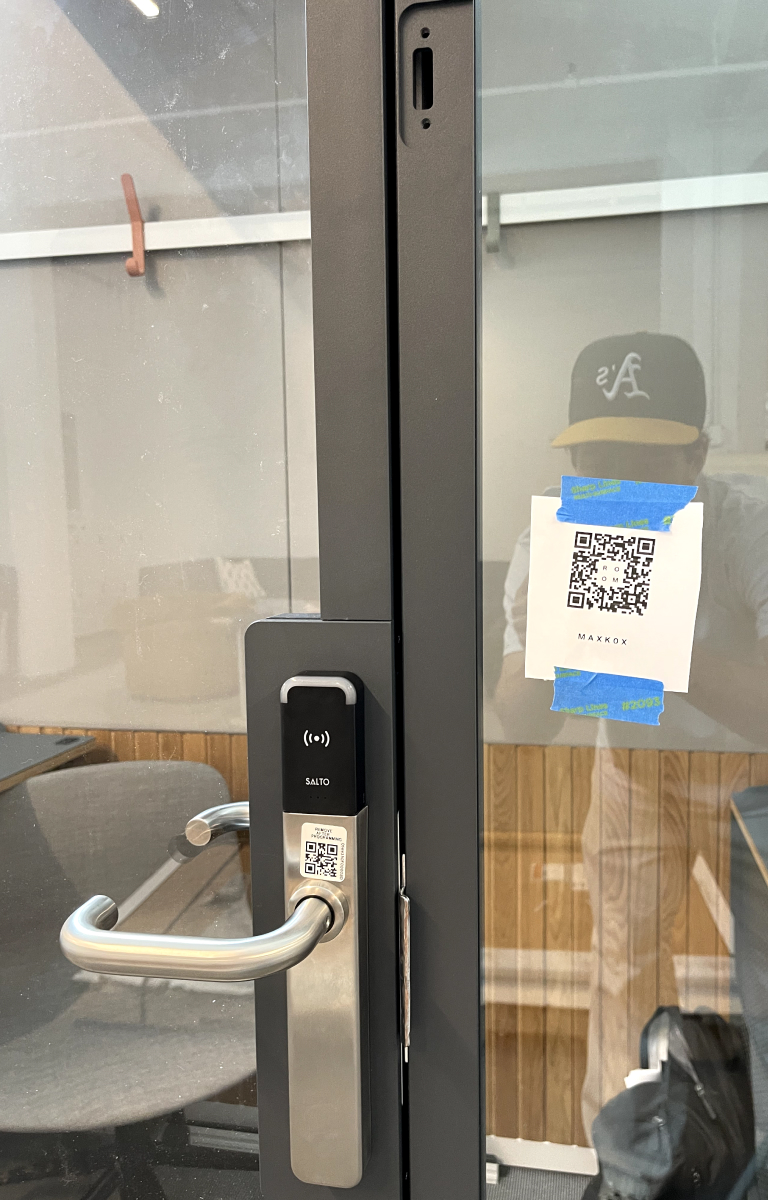
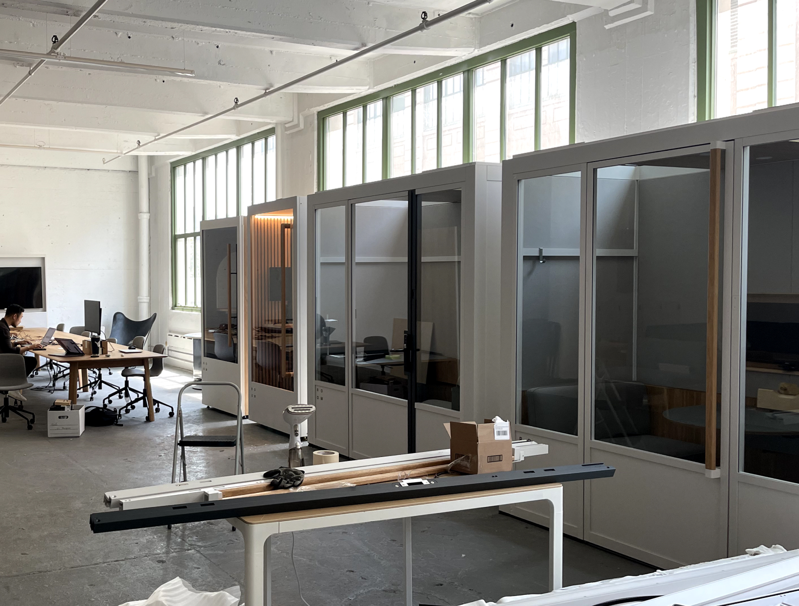
IoT enabled hardware - an office pod, smart lock, and connectivity unit, creating a seamless and secure environment.
Tech Stack
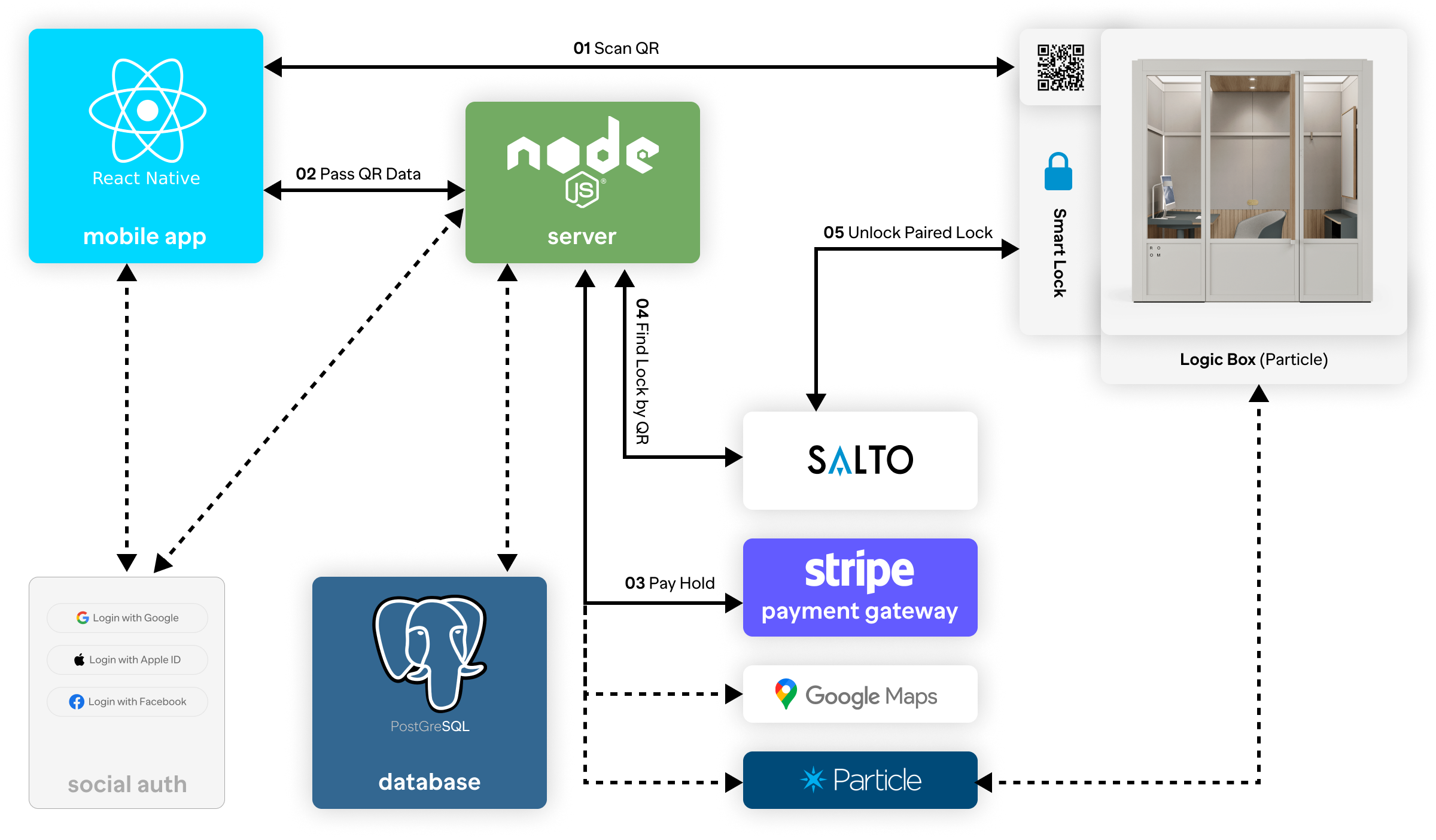
Utilized React Native frontend, Node.js for backend, PostgreSQL database for data management, Stripe for payments, and Google Maps for location services.
Test
Refining for the Real World
In the testing phase, we rigorously evaluated our design to ensure it met user needs and expectations. Through usability testing and feedback collection, we identified areas for improvement and made necessary adjustments. This phase was crucial for validating our solutions, ensuring they are user-friendly, and refining the overall experience before final deployment.
Usability Testing
We conducted guided usability tests internally with our coworkers, using a structured template to observe and analyze their interactions with the app. This approach allowed us to gather valuable insights into user behavior and identify any pain points or areas for improvement. By refining the app based on this feedback, we ensured a more intuitive and user-friendly experience.
Pilot Program
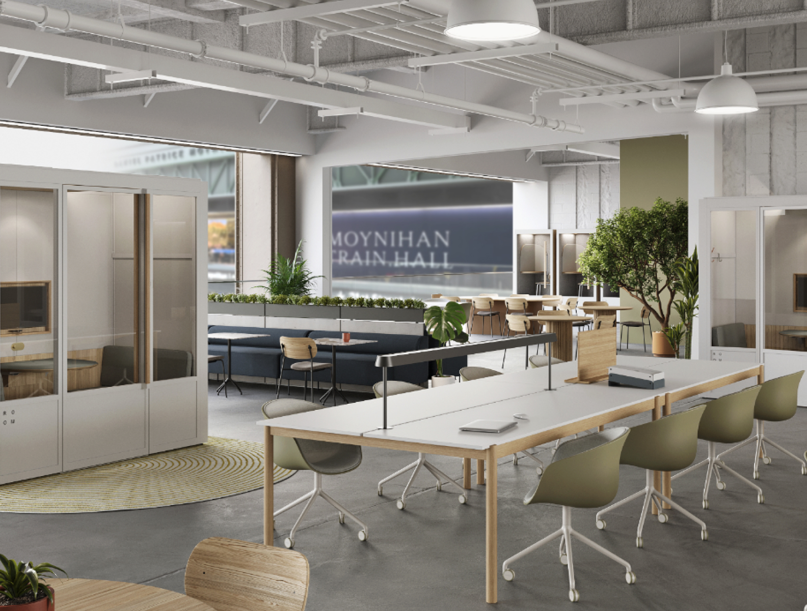
Our pilot program is set to launch in Moyihan Train Hall Metropolitan Lounge in 2023. This launch is designed to gather real-world feedback, allowing us to test and refine our the experience before a more comprehensive roll out.
Other Case Studies
